The Challenge
The identity needed to feel minimal and modern while still carrying the depth and meaning behind the practice of yoga.
Translate conceptual meaning—“to yoke” or unite—into a simple, recognizable mark
Work within a specific typographic direction while creating something distinct
Develop a logo that functions across multiple applications, from signage to printed materials
Extend the identity into physical touchpoints within the studio experience
Approach
I grounded the design in both concept and form, building from typography outward.
Joined the “n” and “y” in the logotype to visually represent the idea of connection
Contained the mark within a circle to symbolize wholeness and unity
Added a subtle outer line to frame the form and reinforce a clean, modern aesthetic
Extended the tagline beyond the circle to create movement and draw the viewer inward
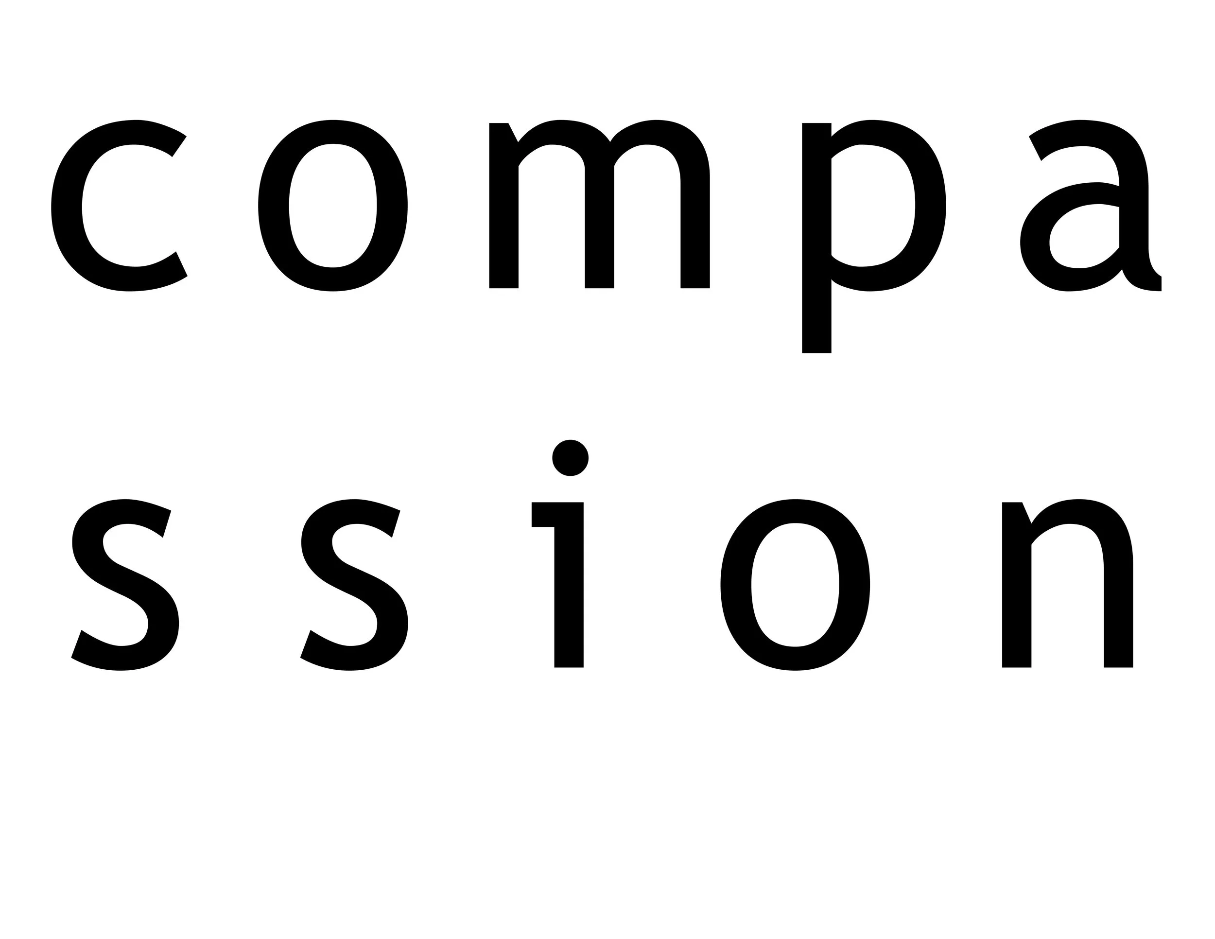
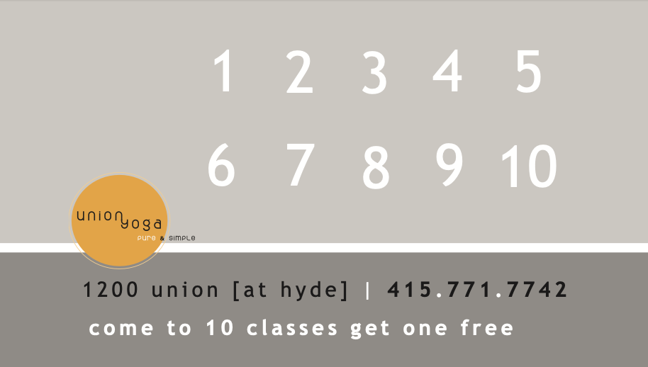
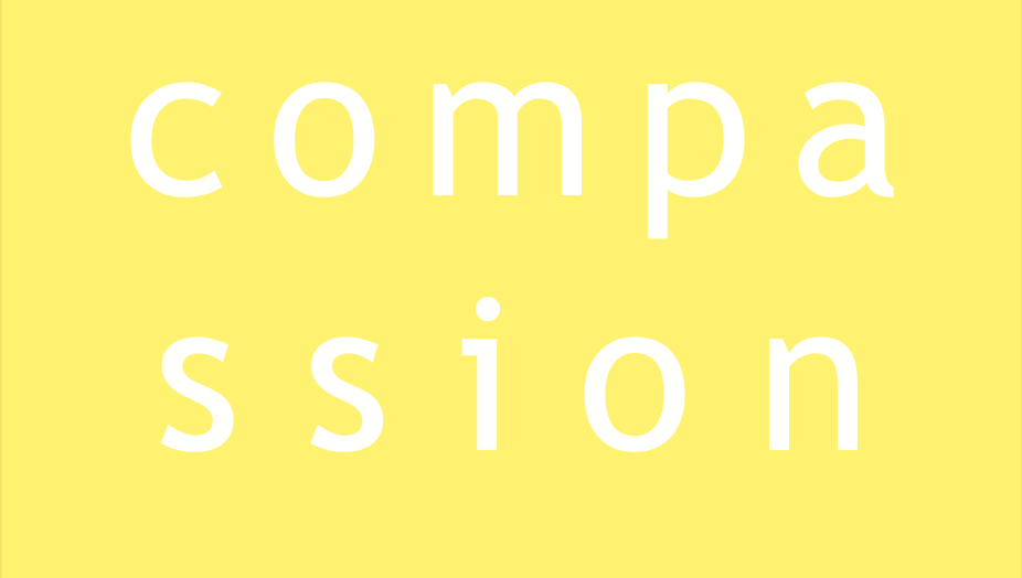
Designed additional elements, including a “Compassion” door piece and punch cards, to carry the brand into the physical space
Union Yoga is a studio rooted in connection and presence. The founder, Martin, sought a simple, modern brand identity based on a clear vision, along with supporting materials for use within the studio and for client engagement.
Logo, Punch Cards, Postcard, and Door Decal for Yoga Studio San Francisco, CA
Outcome
The final identity is simple, intentional, and deeply aligned with the philosophy of the studio.
Communicates meaning through subtle, integrated design choices
Maintains clarity and versatility across multiple applications
Creates a cohesive brand experience from logo to in-studio materials
Deliverables
Logo Design
Door Decal
Punch Cards (Multiple Variations)
Postcard Design
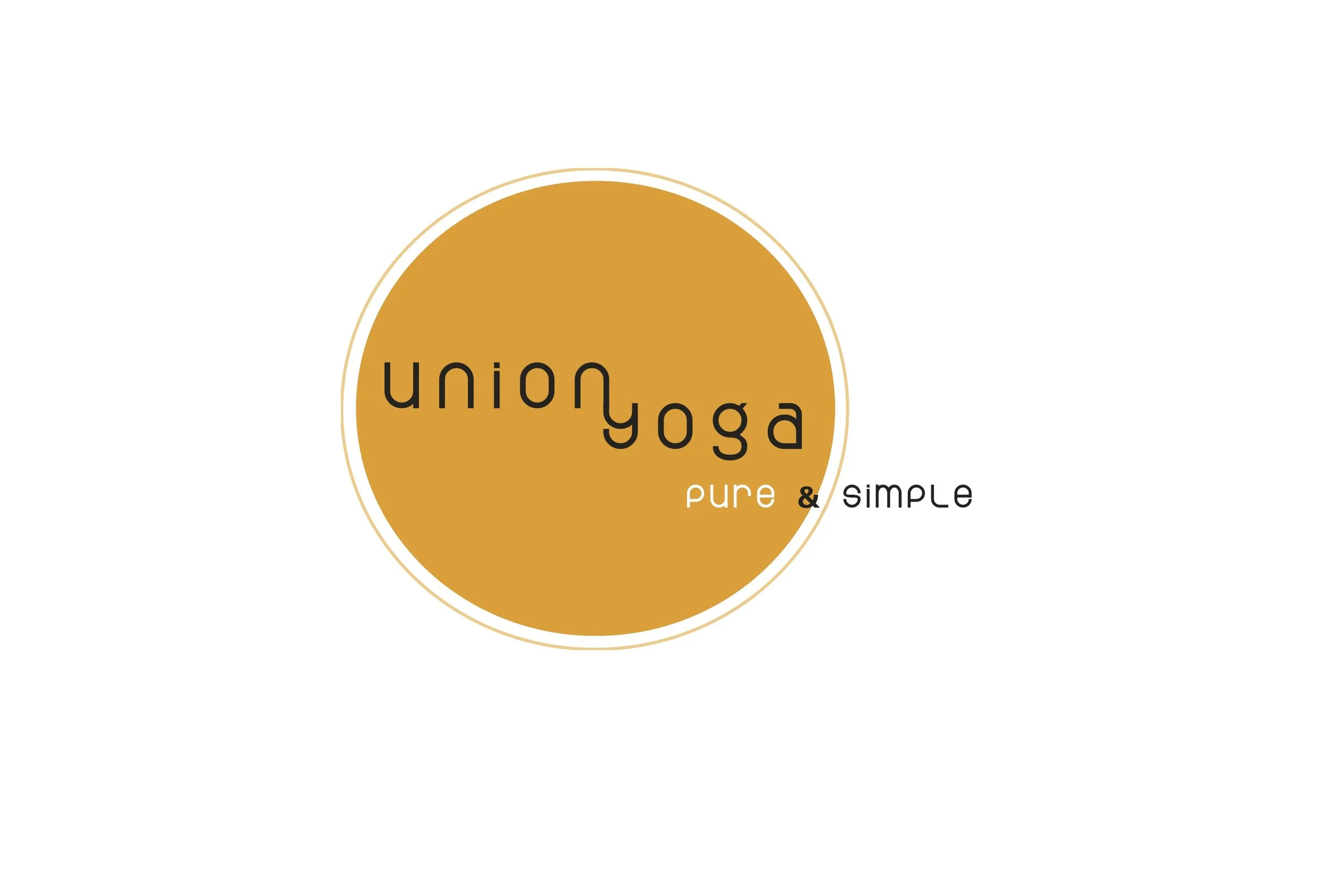
Logo
Vinyl Door Decal
Postcard, Front with Crop Marks

Punch Card, Back
Punch Card Series, with 4 Front Variations