
I Am Clear is a sobriety coaching and water therapy practice founded by Keith, focused on clarity, strength, and transformation. He needed a logo that could embody these principles while incorporating symbolic elements meaningful to his work.
Logo for Addiction Recovery + Water Therapy, Keith Dunne Newport, RI
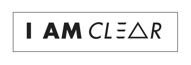
The Challenge
The identity needed to feel bold and grounded while integrating the concept of clarity in a visually compelling way.
Represent abstract ideas like clarity and strength through a simple, memorable mark
Incorporate a triangle element without feeling overly literal or symbolic
Use typography as a primary driver of the visual experience
Create a mark that feels dynamic while remaining clean and legible
Approach
I centered the design around typography and subtle structural elements.
Assigned varying weights within the typeface to guide emphasis and create visual rhythm
Integrated the triangle concept by referencing its three-sided structure within the letterforms
Developed a custom “E” using geometric elements to echo the triangle shape
Focused on clarity in both form and spacing to reinforce the core concept of the brand
Outcome
The final logo is bold, structured, and intentional, reflecting both the philosophy and presence of the brand.
Communicates clarity and strength through typography and form
Integrates symbolic elements in a subtle, modern way
Creates a distinctive and memorable visual identity
Deliverables
Logo Design
Custom Letterform Development
Primary Logo

Secondary Logos
