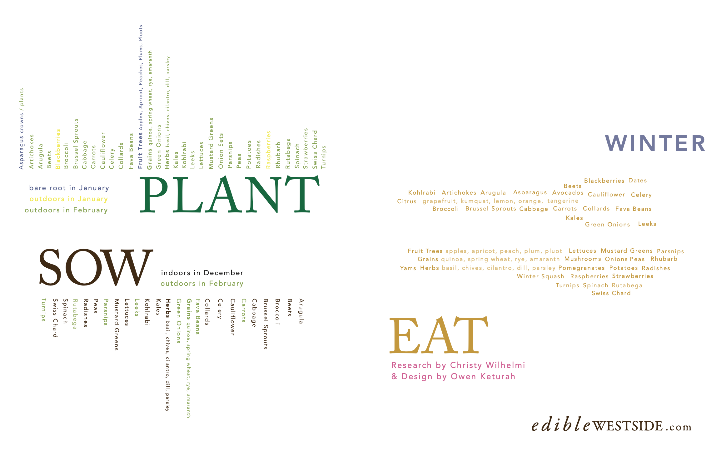
The Challenge
The series needed to function both as an informative editorial and as a visually compelling piece worth keeping over time.
Present a large amount of seasonal information in a clear, digestible format
Create consistency across four quarterly issues while allowing each to feel distinct
Elevate the design so each piece could stand alone as something collectible or display worthy
Balance editorial structure with a more expressive, poster-like quality
Approach
I approached the series as both an information system and a visual collection.
Mapped out the four seasons and assigned a distinct color theme to each
Developed variations within each palette to help organize and differentiate content
Used layout and hierarchy to guide the reader through dense information in an intuitive way
Designed each piece with a poster sensibility, considering composition, balance, and visual impact
Edible Westside is a regional publication focused on local, seasonal food and community. I was commissioned to create a four-part editorial feature highlighting what is available seasonally from local edible sources.
Four Part Letter Page Seasonal Poster in Edible Westside Magazine, Linzy Mahoney Venice, CA
Outcome
The final result is a cohesive seasonal series that functions as both an editorial feature and a collectible set.
Translates complex seasonal information into a clear and engaging format
Creates visual continuity across all four editions while maintaining individuality
Elevates the content into pieces that are both informative and aesthetically compelling
Deliverables
Four-Part Editorial Feature (Quarterly Publication)
Print Layout Design Infographic
Winter

Autumn

Summer

Spring

Bi-fold Poster Variations as featured in Edible Westside