Bonafide Provisions is a brand rooted in traditional bone broth, seeking a set of custom icons to communicate product information in a way that felt both homemade and refined.
Illustrated Icons for Website, Bonafide Provisions Encinitas, CA
The Challenge
The icon set needed to balance clarity and warmth while organizing two distinct categories of information.
Create icons that clearly communicate information at a glance
Maintain a handcrafted, organic feel without losing visual consistency
Differentiate between two groups—“the difference” and “the benefits”—while keeping a cohesive system
Ensure the icons felt aligned with the brand’s grounded, food-based identity
Approach
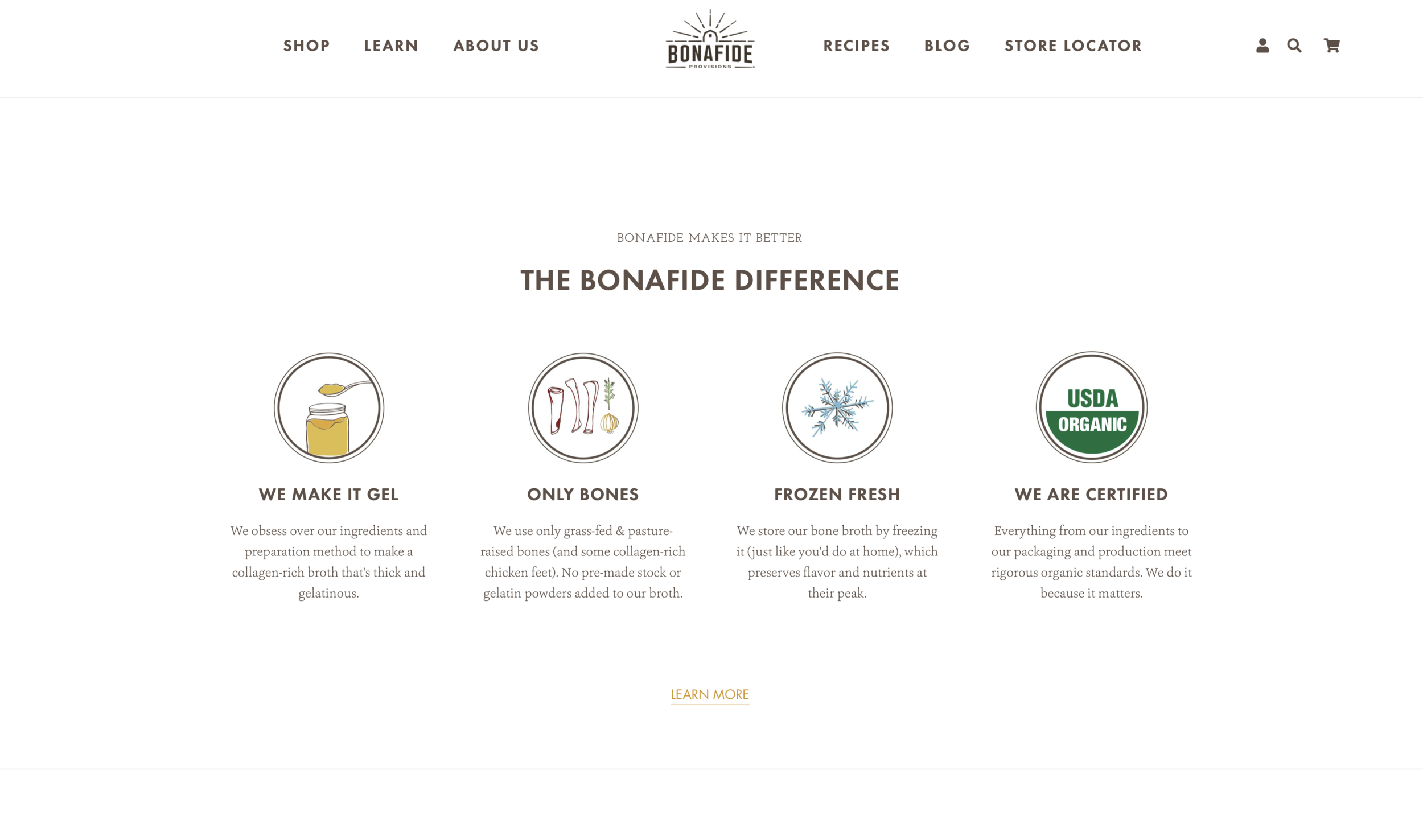
I developed the icons as a unified system rooted in hand-drawn elements and thoughtful structure.
Illustrated all icons by hand to achieve an organic, approachable quality
Refined and digitized each element to ensure clarity and consistency across the set
Introduced framed icons for one category to create distinction, while leaving the others unframed for a more personal feel
Focused on simple forms and clean line work to balance warmth with readability
Outcome
The final icon system is cohesive, functional, and aligned with the brand’s identity.
Communicates key information clearly while maintaining a handcrafted aesthetic
Differentiates content categories through subtle structural choices
Delivers a polished yet organic visual language across the website
Deliverables
Custom Icon Set (8 Icons)
Illustrated + Digitized Assets
As featured on Bonafide Provision’s Website

The Icons: The Bonafide Difference

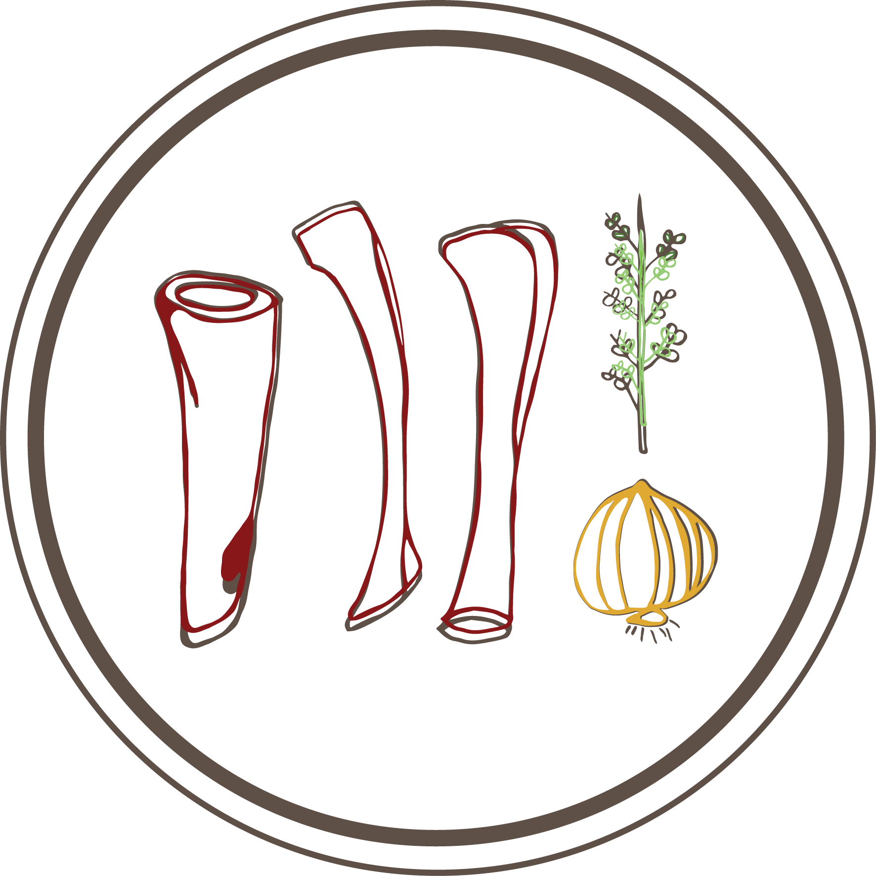

The Icons: Bone Broth Benefits